It’s really important for a freelancer to keep learning and moving forward. I wanted to spend this year doing just that. Forcing myself out of my comfort zone to get better, be more creative and create a whole new commercial portfolio of work while still keeping all the usual plates spinning. I’ve had so many exciting briefs this year from lots of fantastically creative artists and designers and I’ve loved every minute.
One of my favourites came from interiors trend consultancy Porter & Brawn. The brief was part of the fantastic Make It In Design Summer School which I’ve been part of for the last two years. The brief was called ‘Coastal Escape’. Some briefs are more difficult than others when it comes to visual imagery but this one immediately brought up an inner Pinterest board of ideas. Being from the coast myself, I knew I had to nail this one. The beach is my happy place which means I have a whole camera roll of beach life images on tap. I couldn’t wait to get started and the results got noticed by Porter & Brawn who said that my design ‘grabbed attention but also demonstrated commercial viability and perfectly answered the brief.’ Chuffed much?
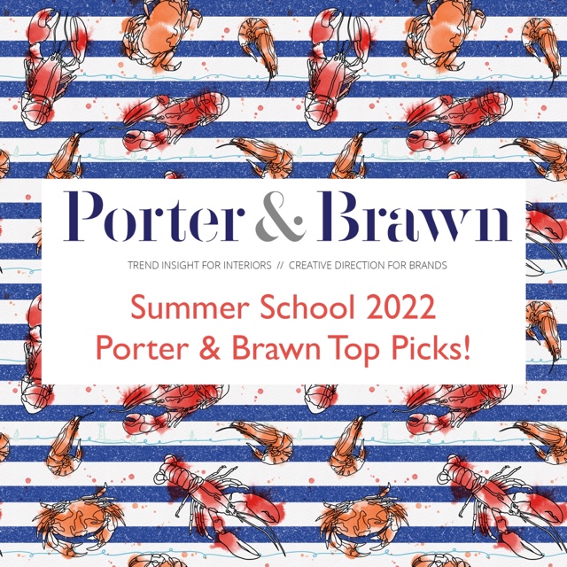
Porter & Brawn loved the hero print I’d created for ‘The Catch’ and voted it one of their ‘Top Picks’ for Summer School 2022.
The creative process: As soon as I read the brief I had something in my head for it. I just hoped that I would manage to translate it creatively. I immediately grabbed my iPad and drew an ugly version of it so it wouldn’t go out of my head. I then did a brainstorm on a sheet of plain paper. I always start like this as it’s a good way to do a brain dump and get everything out. Sometimes it’s just that, a load of rubbish. Other times, there’s a hidden gem in there. I followed that up with a Pinterest board. I don’t spend too much time on it. It’s just good to see what keeps coming up and what piques your interest. See my Pinterest board here.
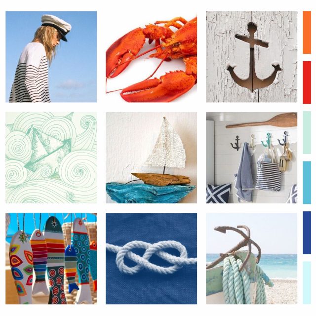
From there I created a mood board. This is where things get more serious. I narrow down my thoughts and pick a colour palette. Occasionally I’ll tweak the colour palette once I start working on the design but I try to stick to my initial instincts as that usually works better than overthinking it.
The idea: During the Creative Retreat with Becca Courtice, I’d seen an artist doing one liners. You know those drawings that have a continuous line and look really simple to do? Well, let me tell you, they’re not. But I knew I wanted my sea life to look like that with added splashes of colour. The continuation of the line reflects their existence long after we’re gone and the colourful splashes of watercolour shows not only where they came from but the beautiful chameleon like colour change from dull grey to vibrant oranges and reds. The perfect accompaniment was a salty textured stripe. Let’s not forget that Breton stripes never go out of fashion and are a guaranteed wardrobe staple every summer. So I combined the whole lot. More is more, am I right?
Of course the co-ordinates for this pattern are a bit of a calmer ocean but bob perfectly on the waters of the main hero pattern. A salty background with images of lighthouses, boats and flags and a watercolour splash on Breton stripes make this collection a breath of fresh sea air.
I could definitely keep adding to this collection. I created secondary patterns for the individual crustaceans which I thought would work beautifully on ceramics. I’d love to license this collection. Who knows what the future will bring for my canny crustaceans?


